
Writing Task-1 (Pie Chart Graph for AC students)

Task - 1

The three pie charts below show the changes in annual spending by a particular UK school in 1981, 1991 and 2001.

Summarise the information by selecting and reporting the main features, and make comparisons where relevant.

Spending by a particular UK school in 1981 and 1991
spending by a particular UK school in 2001
Sample Answer ▼
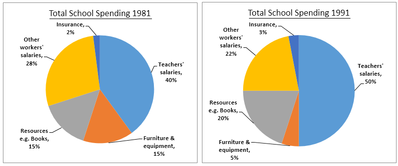
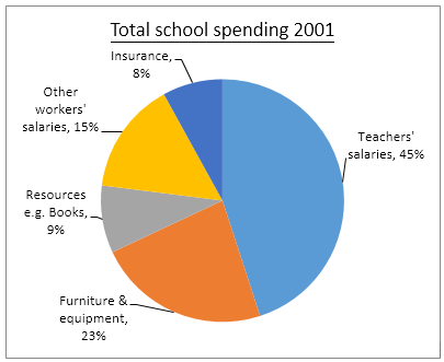
The given pie charts illustrate a UK school's annual spending and show the changes over two decades.

As is seen in the provided pie charts, the school spent an increasing percentage of money on teachers' salaries, with the maximum of 50% being spent in 1991, after which it was reduced by 5% in 2001. Also, this remained the area, where the highest percentage of the money was spent, in the given three years. Expenditure on other workers' salaries decreased significantly over the years with 28%, 22% and 15% in 1981, 1991 and 2001 respectively.

Again, the percentage spent on resources like books also decreased after a slight increase of 5% in 1991. Investment on furniture and equipment saw a substantial decline from 15% to 5% in the first 10 years, before increasing again up to 23% in 2001. Finally, the least percentage of annual spending was on insurance over the two decades, with a small hike from 2% in 1981 to 8% in 2001.

Comments

Popular posts from this blog

Weekly Assignment (AC)

Line Graph Worksheet - Gap Fill The line graph illustrates the number of spreads consumed from 1981 to 2007, in grams. Summarize the information by selecting and reporting the main features and make comparisons where relevant. Gap Fill - Choose the correct word The graph shows the quantity of margarine, low-fat spreads, and butter consumed between 1981 and 2007. The quantities are measured in grams. Over the period 1981 to 2007 as a whole, there was  1.   ............................ in the consumption of butter and margarine and  2.  ...................................... in the consumption of low-fat spreads. Butter was the most popular fat at the beginning of the period, and consumption   3 . ........................................... of about 160 grams in 1986. After this, there was  4.   .......................................................... The consumption of margarine began lower than that for butter at 90 gra...

Writing-AC-Task-1 (Diagram)

Task 1 The diagram below shows the life cycle of a salmon, from egg to adult fish. Summarise the information by selecting and reporting the main features and make comparisons where relevant. Tips: Write your description of the diagram by answering the following questions: Where and in what form do salmon begin their lives? When the young salmon emerge from eggs, where are they reared? Before swimming to the ocean, where do the young fish migrate to? What happens to salmon during their time in the ocean? Where do the adult fish then travel to, and why? What happens that completes the cycle? How do you write an overview or summary about a 'life cycle' diagram?  Count the number of stages in the life cycle. Decide on a beginning and an end point in the cycle. Sample Answer ▼ The provided diagram displays the life cycle of a salmon fish dividing it into different stages, from birth to maturity. Overall, a salmon fish g...

Writing-AC-Task-1 (TABLE)

Task 1 The tables below provide information about the consumption and production of potatoes in five parts of the world in 2006.  Summarise the information by selecting and reporting the main features, and make comparisons where relevant. Sample Answer ▼ The table data illustrates per person potato consumption and total production of this crop in five different regions in the world- South and Central America, Africa, North America, Europe, and Asia, in 2016. According to the information provided, Europeans ate more potatoes than the citizens of other regions on an average and Asia harvested the largest quantity of potatoes in 2016. In details, Europeans were the chief consumers of potatoes in 2006 as each European ate 96.1 kilograms potatoes. Then, North America and Asia followed the second and the third highest consumer list of this crop, 57.9 and 25.8 kg per person intake respectively. It is interesting to note that an average European consumed almost the ...