Line Graph Worksheet - Gap Fill
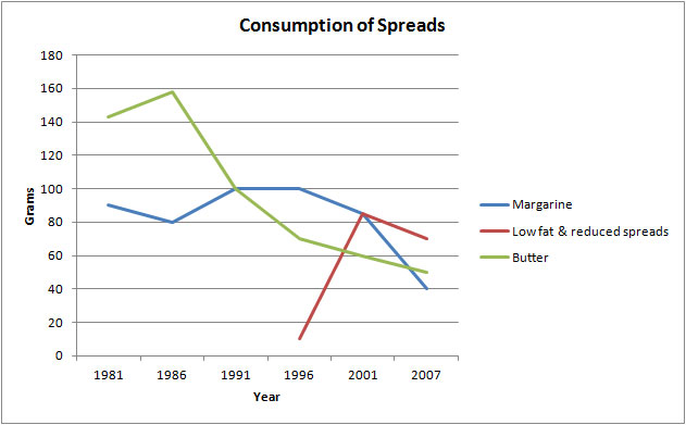
The line graph illustrates the number of spreads consumed from 1981 to 2007, in grams.
Summarize the information by selecting and reporting the main features and make comparisons where relevant.
Gap Fill - Choose the correct word
The graph shows the quantity of margarine, low-fat spreads, and butter consumed between 1981 and 2007. The quantities are measured in grams. Over the period 1981 to 2007 as a whole, there was 1. ............................in the consumption of butter and margarine and 2. ......................................in the consumption of low-fat spreads.
Butter was the most popular fat at the beginning of the period, and consumption 3. ...........................................of about 160 grams in 1986. After this, there was 4. ..........................................................
The consumption of margarine began lower than that for butter at 90 grams. Following this, in 1991, it 5. ...............................................that of butter for the first time, but after 1996 there was 6...........................................in the amount consumed, which seemed set to continue.
Low–fat spreads were introduced in 1996, and they saw 7. .............................in their consumption from that time, so that by about 2001 they were 8. ......................................than either butter or margarine.
IELTS Line Graph Worksheet - Full Answer
The graph shows the quantity of margarine, low-fat spreads, and butter consumed between 1981 and 2007. The quantities are measured in grams. Over the period 1981 to 2007 as a whole, there was 1. a significant decrease in the consumption of butter and margarine and a 2. a marked increase in the consumption of low fat-fat spreads.
Butter was the most popular fat at the beginning of the period, and consumption 3. reached a peak of about 160 grams in 1986. After this, there was 4. a sharp decline.
The consumption of margarine began lower than that for butter at 90 grams. Following this, in 1991, it 5. exceeded that of butter for the first time, but after 1996 there was 6. a steady downward trend in the amount consumed, which seemed set to continue.
Low–fat spreads were introduced in 1996, and they saw 7. a significant rise in their consumption from that time, so that by about 2001 they were 8. more popular than either butter or margarine.
Comments
Post a Comment