
WRITING AC TASK-1 (Line Graph)

Task 1

The line graphs below show the production and demand for steel in million tonnes and the number of workers employed in the steel industry in the UK in 2010.


Summarize the information by selecting and reporting the main features, and make comparisons where relevant.
Production and demand for steel in the UK in 2010

Number of workers employed in the steel industry in the UK


Sample Answer ▼

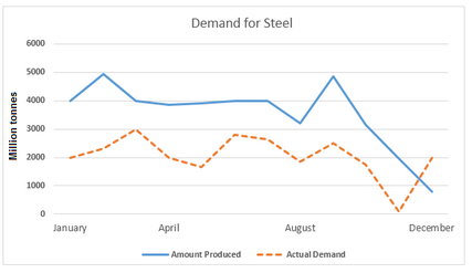
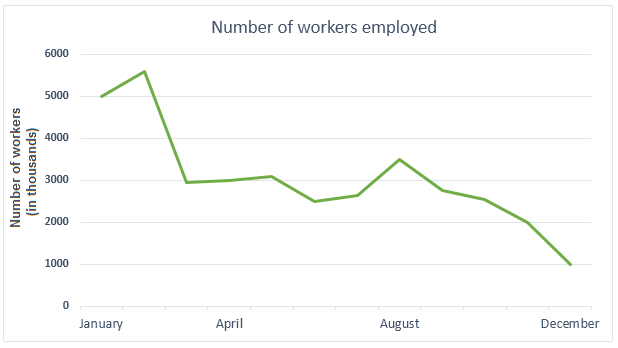
The first line graph presents a comparative analysis of the market requirement for steel and production of this material in 2010 in the UK. The second graph shows the total number of workers employed in this industry in the same year. Overall, the steel production in the UK in 2010 sur-plused the demand, except at the end of the year.

The production of steel throughout the time exceeded the demand. In the first quarter of the year, the actual market call for steel started at 2000 million tonnes in January, but production was two times with a continuous rise. Later somewhere in April, the demand started reducing, but production was soaring and reached 5000 million tonnes. Moreover, demand showed further fluctuations approximately till November and fell to almost zero whereas production of the steel attained plateau for some time with further variations and started falling later. After that, in December the demand was nearly double than the production.

From the second graph, it is evident that the total number of workers in the steel industry in the UK was 5000,000 in January and it rose for a month or so. But it then showed a sudden plunge and reached 3000,000 by April, with further fluctuations in number till August. However, the number of workers continued to fall and reached 1000,000 by the end of the year.


Comments

Popular posts from this blog

Weekly Assignment (AC)

Line Graph Worksheet - Gap Fill The line graph illustrates the number of spreads consumed from 1981 to 2007, in grams. Summarize the information by selecting and reporting the main features and make comparisons where relevant. Gap Fill - Choose the correct word The graph shows the quantity of margarine, low-fat spreads, and butter consumed between 1981 and 2007. The quantities are measured in grams. Over the period 1981 to 2007 as a whole, there was  1.   ............................ in the consumption of butter and margarine and  2.  ...................................... in the consumption of low-fat spreads. Butter was the most popular fat at the beginning of the period, and consumption   3 . ........................................... of about 160 grams in 1986. After this, there was  4.   .......................................................... The consumption of margarine began lower than that for butter at 90 gra...

Writing-AC-Task-1 (TABLE)

Task 1 The tables below provide information about the consumption and production of potatoes in five parts of the world in 2006.  Summarise the information by selecting and reporting the main features, and make comparisons where relevant. Sample Answer ▼ The table data illustrates per person potato consumption and total production of this crop in five different regions in the world- South and Central America, Africa, North America, Europe, and Asia, in 2016. According to the information provided, Europeans ate more potatoes than the citizens of other regions on an average and Asia harvested the largest quantity of potatoes in 2016. In details, Europeans were the chief consumers of potatoes in 2006 as each European ate 96.1 kilograms potatoes. Then, North America and Asia followed the second and the third highest consumer list of this crop, 57.9 and 25.8 kg per person intake respectively. It is interesting to note that an average European consumed almost the ...

Writing Task-1 (Bar Column Graph)-

Task 1 The graph below shows the changes in the maximum number of Asian elephants between 1994 and 2007. Summarise the information by selecting and reporting the main features, and make comparisons where relevant. - Show / Hide Sample Answer - The bar graph provides information on the number of elephants in different countries between 1997 and 2004. Generally speaking, in India and Myanmar, the maximum number of elephants inhabited and the total number of elephants decreased over time. As is presented in the bar graph, approximately 10 thousand elephants lived in India in 1997 which was the highest among the given countries. Myanmar is the second largest country for elephants’ dwelling. Vietnam, Cambodia, Laos and China had about 1000 elephants in 1997 while Malaysia, Sri Lanka and Thailand had roughly 3000 elephants. The least number of elephants were in China in 1997. After 7 years, in 2004, the number of elephants in all countries decreased except in Laos. Th...